
Design Systems in 2025: The Complete Guide to Creating and Implementing Design Systems
Design systems have become the cornerstone of modern digital product development, transforming how teams build and scale user experiences. In 2025, with the increasing complexity of digital products, having a robust design system isn't just nice to have—it's essential for survival in the competitive digital landscape.
This comprehensive guide will take you through everything you need to know about design systems, from fundamental concepts to advanced technical implementation. Whether you're a designer, developer, or product manager, you'll find actionable insights to help you create and maintain an effective design system.
What Is a Design System?
A design system is a comprehensive set of standards, documentation, and components that unify product design across platforms and teams. It's the single source of truth that combines design principles, component libraries, and technical documentation into a cohesive ecosystem.
Core Components of a Design System
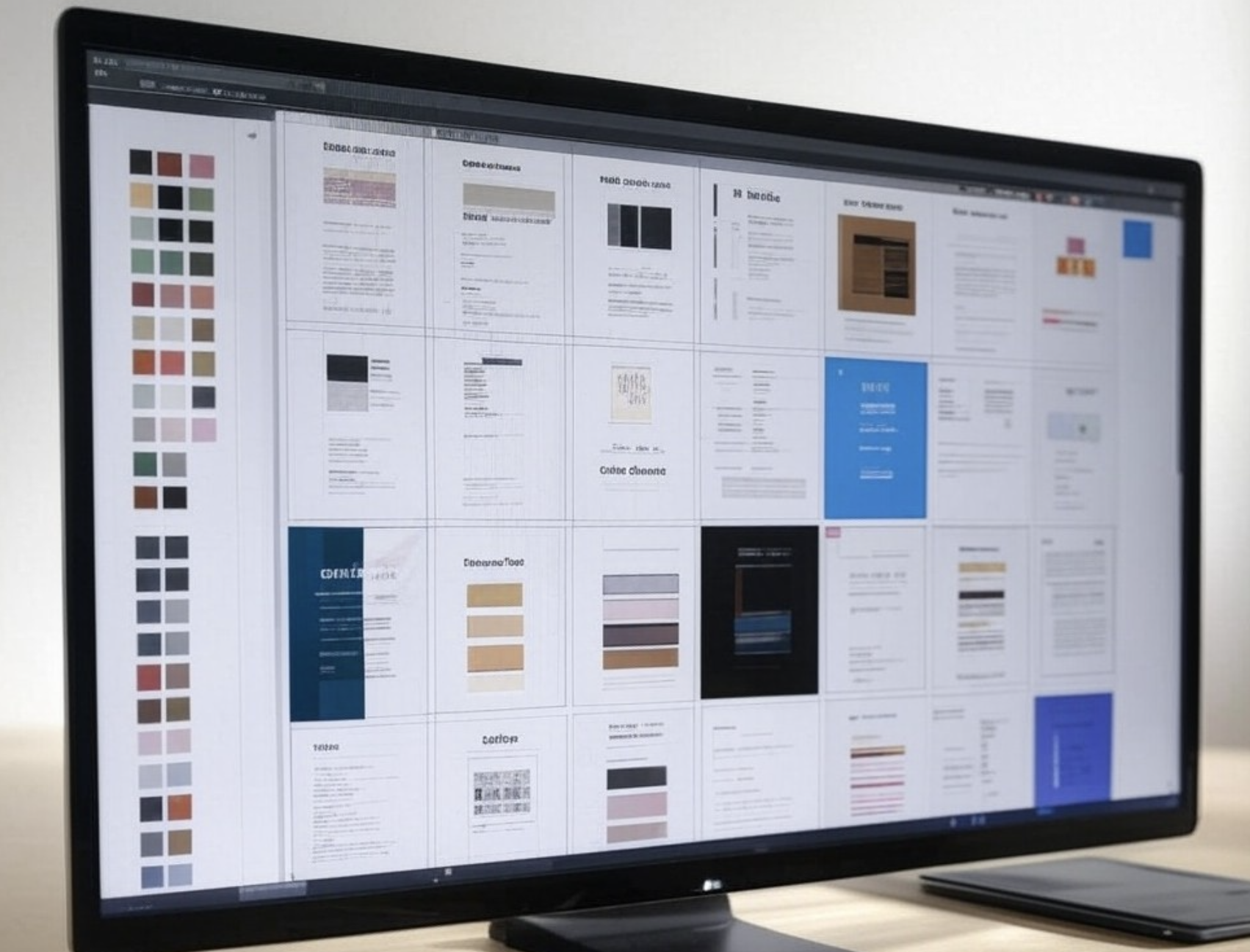
Every comprehensive design system includes:
Design Principles: The foundational rules and values that guide design decisions
Component Library: Reusable UI elements with consistent behavior and styling
Technical Documentation: Implementation guidelines and code examples
Design Tokens: Design variables that store visual design attributes
Usage Guidelines: Clear instructions for when and how to use components
Pattern Library: Common UI patterns and their implementation
Industry Leaders in Design Systems
Let's examine some remarkable design systems that set industry standards:
1. Google's Material Design
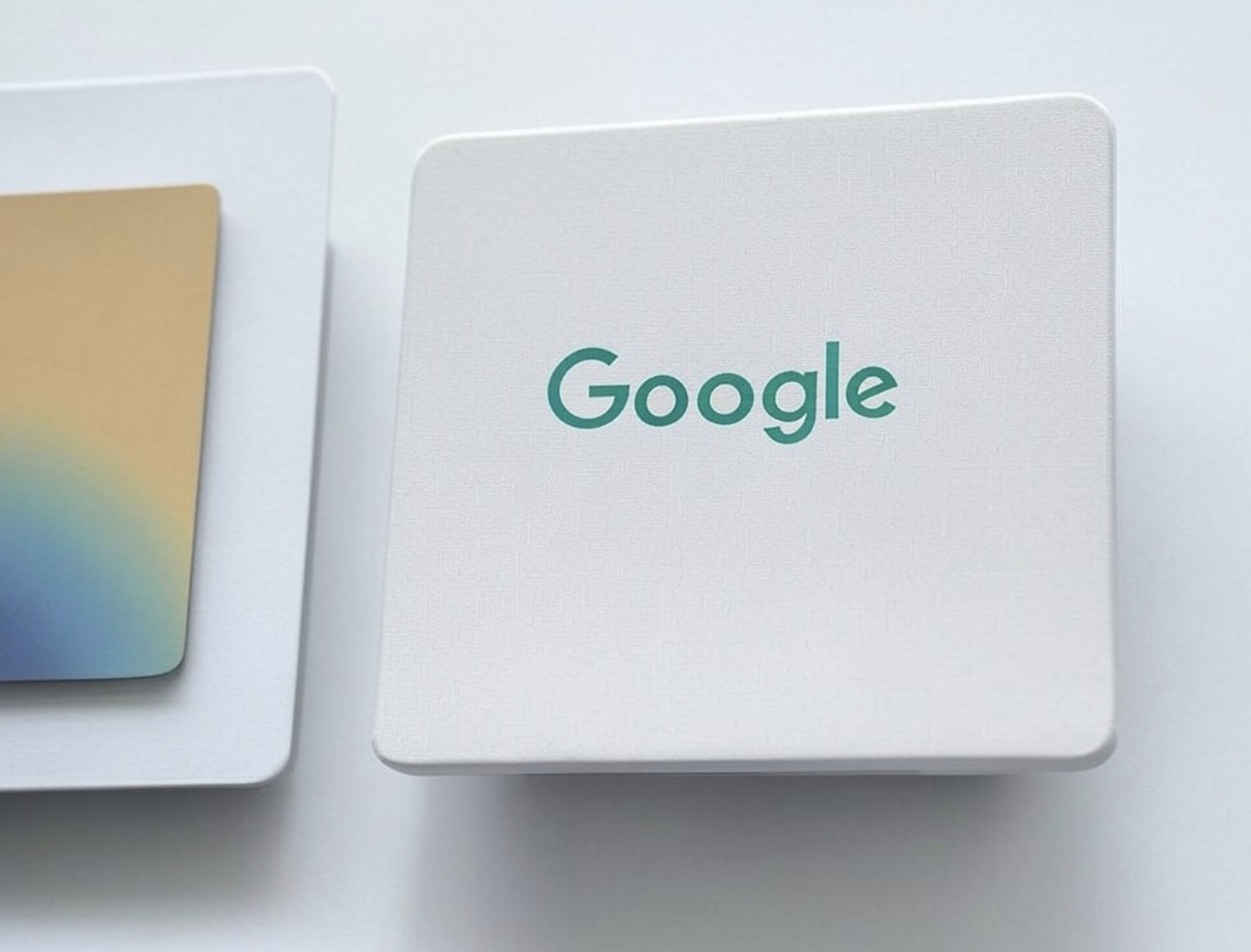
Material Design revolutionized interface design by introducing:
- Physical surface and shadow principles
- Consistent interaction patterns
- Cross-platform adaptability
- Rich animation guidelines
- Comprehensive component documentation
2. IBM's Carbon Design System
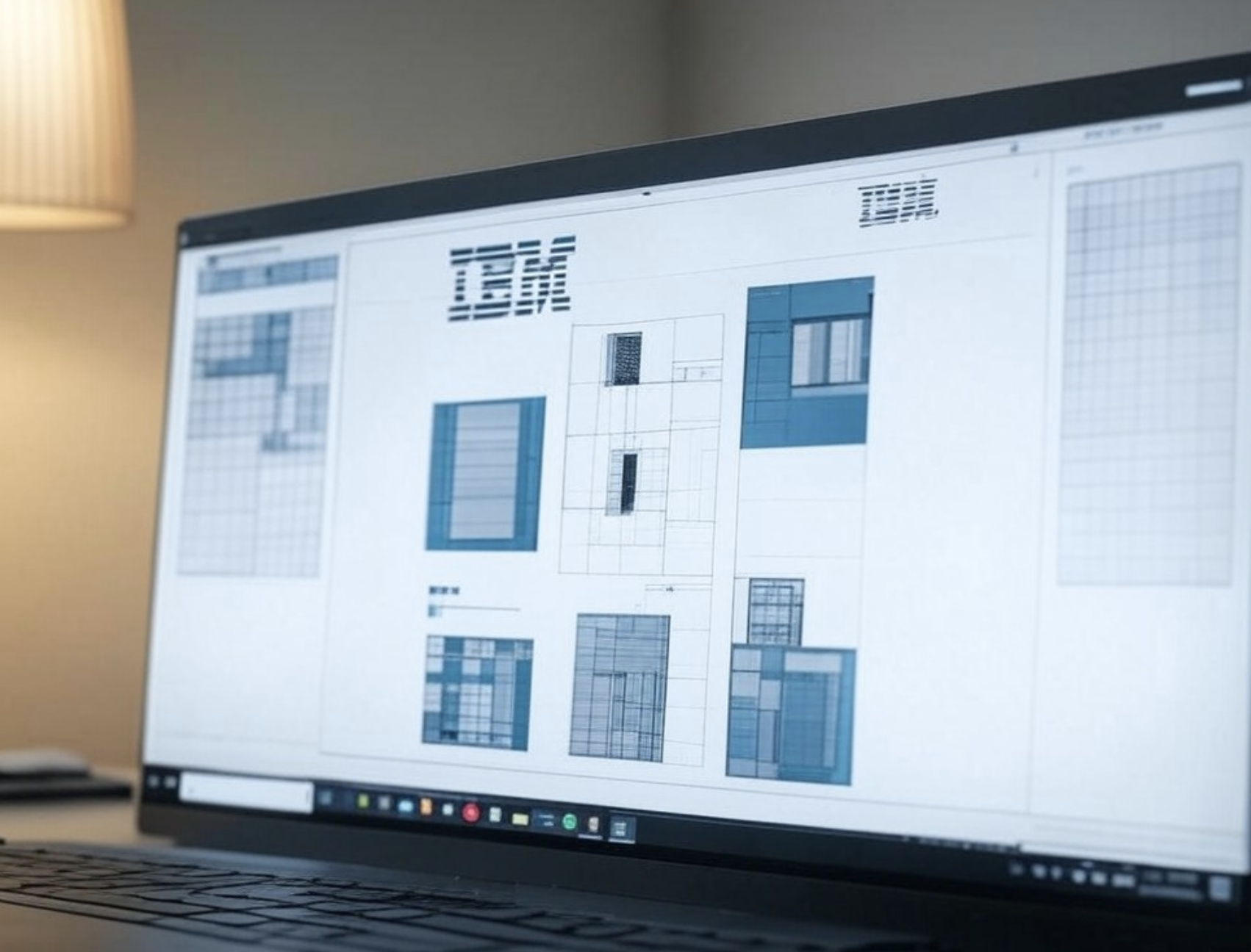
Carbon demonstrates enterprise-scale design systems through:
- Modular component architecture
- Accessibility-first approach
- Comprehensive documentation
- Open-source community engagement
- React component library
3. Airbnb's Design Language System
Airbnb revolutionized their development process through:
- Unified design language across platforms
- Automated design-to-code workflows
- Custom design tools development
- Robust component testing framework
- React Native integration
4. Spotify's GLUE
GLUE demonstrates excellence in:
- Cross-platform consistency
- Dynamic theming capabilities
- Extensive accessibility features
- Performance optimization
- Component versioning
Technical Implementation Guide
Let's dive into the technical aspects of building a design system:
Setting Up Design Tokens
Design tokens are the foundation of your system. Here's how to structure them:
:root {
  /* Colors */
  --color-primary-100: #E6F3FF;
  --color-primary-500: #0066CC;
  --color-primary-900: #003366;

  /* Typography */
  --font-size-xs: 0.75rem;
  --font-size-sm: 0.875rem;
  --font-size-base: 1rem;

  /* Spacing */
  --spacing-1: 0.25rem;
  --spacing-2: 0.5rem;
  --spacing-4: 1rem;

  /* Shadows */
  --shadow-sm: 0 1px 2px rgba(0, 0, 0, 0.05);
  --shadow-md: 0 4px 6px rgba(0, 0, 0, 0.1);
}
Component Architecture
Here's an example of a well-structured React button component:
import React from 'react';
import PropTypes from 'prop-types';

const Button = ({
  variant = 'primary',
  size = 'medium',
  children,
  disabled = false,
  onClick,
  ...props
}) => {
  const baseStyles = 'rounded-md font-medium transition-colors';

  const variants = {
    primary: 'bg-primary-500 text-white hover:bg-primary-600',
    secondary: 'bg-gray-200 text-gray-800 hover:bg-gray-300',
    ghost: 'bg-transparent hover:bg-gray-100'
  };

  const sizes = {
    small: 'px-3 py-1 text-sm',
    medium: 'px-4 py-2',
    large: 'px-6 py-3 text-lg'
  };

  return (
    <button
      className={`${baseStyles} ${variants[variant]} ${sizes[size]}`}
      disabled={disabled}
      onClick={onClick}
      {...props}
    >
      {children}
    </button>
  );
};

Button.propTypes = {
  variant: PropTypes.oneOf(['primary', 'secondary', 'ghost']),
  size: PropTypes.oneOf(['small', 'medium', 'large']),
  children: PropTypes.node.isRequired,
  disabled: PropTypes.bool,
  onClick: PropTypes.func
};

export default Button;
Testing Strategy
Implement comprehensive testing for your components:
import { render, fireEvent } from '@testing-library/react';
import Button from './Button';

describe('Button Component', () => {
  test('renders with different variants', () => {
    const { rerender, getByRole } = render(
      <Button variant="primary">Click me</Button>
    );

    expect(getByRole('button')).toHaveClass('bg-primary-500');

    rerender(<Button variant="secondary">Click me</Button>);
    expect(getByRole('button')).toHaveClass('bg-gray-200');
  });

  test('handles click events', () => {
    const handleClick = jest.fn();
    const { getByRole } = render(
      <Button onClick={handleClick}>Click me</Button>
    );

    fireEvent.click(getByRole('button'));
    expect(handleClick).toHaveBeenCalledTimes(1);
  });
});
Theme Management
Implement robust theme switching capabilities:
const ThemeProvider = ({ children }) => {
  const [theme, setTheme] = useState('light');

  const toggleTheme = () => {
    setTheme(current => current === 'light' ? 'dark' : 'light');
    document.documentElement.setAttribute('data-theme', theme);
  };

  return (
    <ThemeContext.Provider value={{ theme, toggleTheme }}>
      {children}
    </ThemeContext.Provider>
  );
};Optimize your design system for performance:
Bundle Size Management
// Using dynamic imports for components
const Button = React.lazy(() => import('./components/Button'));
const Card = React.lazy(() => import('./components/Card'));

// Component wrapper with loading state
const AsyncComponent = ({ component: Component, ...props }) => (
  <Suspense fallback={<LoadingSpinner />}>
    <Component {...props} />
  </Suspense>
);
Style Dictionary Configuration
module.exports = {
  source: ['tokens/**/*.json'],
  platforms: {
    web: {
      transformGroup: 'web',
      buildPath: 'build/',
      files: [{
        destination: 'tokens.css',
        format: 'css/variables',
        options: {
          showFileHeader: false
        }
      }]
    },
    ios: {
      transformGroup: 'ios',
      buildPath: 'build/ios/',
      files: [{
        destination: 'StyleDictionary.swift',
        format: 'ios-swift/class.swift',
        className: 'StyleDictionary'
      }]
    }
  }
};Follow these best practices for successful implementation:
- 🤝 Clear governance model and contribution guidelines
- 📈 Semantic versioning and change management
- 🔄 Automated update and deployment processes
- 📱 Cross-platform testing and validation
- 🎯 Usage analytics and adoption metrics
Track these key metrics to measure your design system's impact:
- Design consistency scores across products
- Development velocity and time-to-market
- Designer and developer efficiency
- Component adoption rates
- User satisfaction and feedback
- Accessibility compliance scores
- Performance benchmarks
The future of design systems includes:
- AI-powered component suggestions
- Automated accessibility compliance
- Real-time collaboration features
- Design-to-code automation
- Enhanced personalization capabilities
- Cross-platform synchronization
- Automated performance optimization
Creating a design system is an ongoing journey of improvement and iteration. Start with your core components, establish clear guidelines, and grow your system based on team needs and user feedback.
Ready to transform your design and development workflow? Start building your design system today! 🚀